The Living Thread Cover Journey...
Craig Fridey

As part of the upcoming release for, The Living Thread, I wanted to share some stories about the process for Cover Design, as well as some key lessons learnt along the way, and seize an opportunity to reference a new colour I discovered called 'Goose-turd green'.
They say you should never judge a book by it's cover. They also say we should drink 8 glasses of water per day, that you should look both ways before crossing the road and that if you're lost you should stop and ask for directions instead of continually driving in one direction for several hours until you arrive at what appears to be an abandoned garage in the middle of nowhere. At this garage you will be greeted by a single employee, and learn that the cost of fuel at this garage rivals the cost of single malt.... My point is sometimes we do the things we shouldn't do. One of those things we do, is judge a book by its cover.
Have you ever looked at a novel and thought, "this cover is horrendous, but I'm not going to let that stop me from making my way through all 900 pages of 'The Missionary Position: Mother Teresa in Theory and Practice'?" Maybe you're the one percent, in which case I applaud you, but most of us do judge a book by it's cover. Because of this simple fact, I decided to employ the help of some great artists to assist with the assemble the cover of my debut book 'The Living Thread'.
Designing a Cover is an arduous task if you've never been through the process before. There are a few administrative components and dependencies before you get to start negotiating how much Goose-turd green is too much Goose-turd green in the overall image (Note: Goose-turd green is an actual colour).
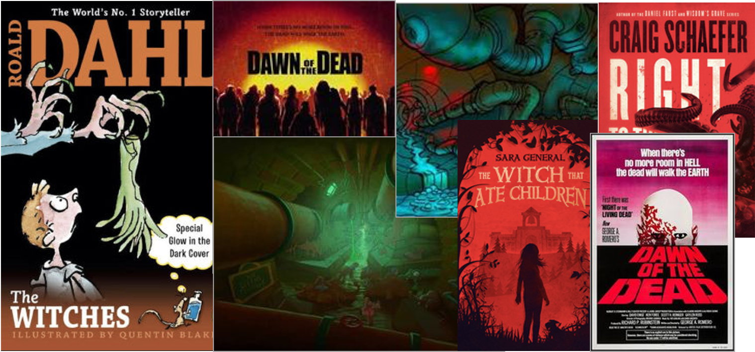
The first thing I did was send some images through to my illustrator, Adam (adamgilesart@gmail.com). The intent of this was to provide him some guidance around the overall style and feel of the cover that would represent the book.
The title 'The Living Thread' is an obvious play on zombie film titles from the 1960's onward. This was important for me to capture in the design, although the book isn't a pure horror story which meant I had to also provide some reference to Adam. I wouldn't want a potential reader to open the book expecting sheer terror, and gore only to be confronted with a story about talking footwear rescuing their pair from a circus. Almost more importantly, I'd hate for a young reader seeking adventure, laughter and a light scare to be too frightened to open it.
Side note: As a child, I once hid a book about UFO Encounters behind my parents stereo system. It scared me to the point of not wanting in my bedroom because the first page had suggested that if Aliens found out you were taking an interest in them, this would increase the likelihood of you being abducted.
I thought maybe if they came for me, they'd settle for just taking the book, and if I was lucky they'd also take my parents Dr Hooks Greatest Hits record too (if you've never heard your parents partying into the early hours of a Sunday morning singing Silvia's Mother, you've lived a privileged life).
So to help establish some balance in my ideas around the cover's style, I provided Adam with the suite of images below. I hoped that the breadth in style, but collective feel of this imagery would assist in him capturing the uniqueness of a cross-genre speculative fiction story.

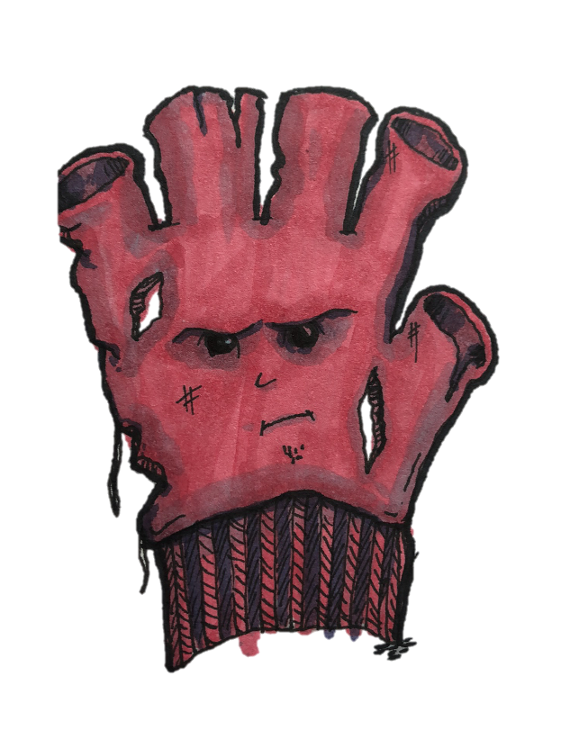
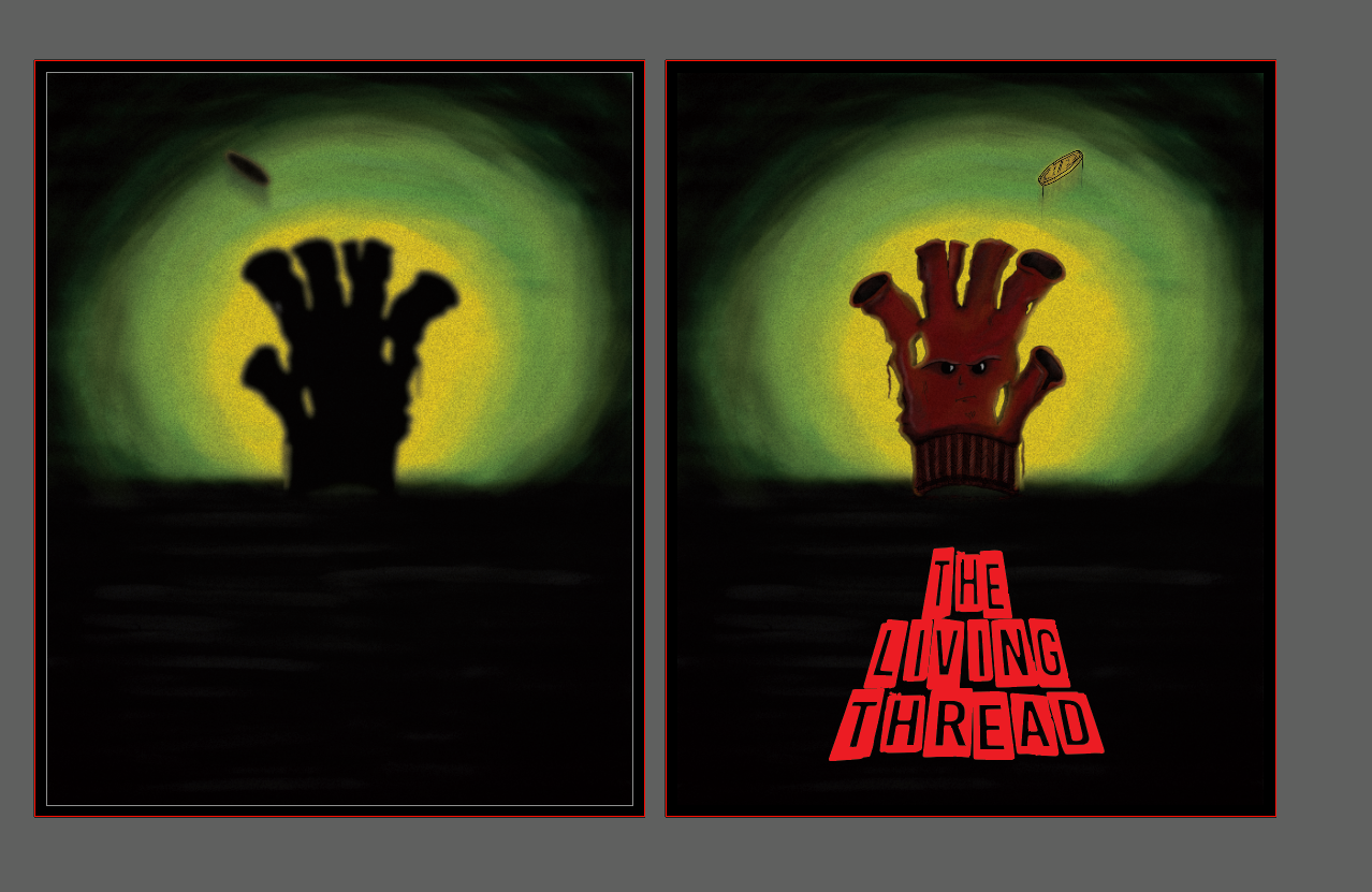
Adam then sent through some character sketches, and several concepts for how he thought the cover might convey the right brand for the story. Having a few options meant I able to mix and match elements from each of the ideas until we had a single concept agreed upon to move forward. We elected to progress with one of the main characters flipping a coin by a fire barrel.
At this point Adam was able to start refining the image, and adding colors. He checked in regularly although I'm a big believer in letting an expert progress unhindered in their field of expertise. At the end of the day, not everyone has an artistic eye. If you need evidence of this there is a man out there with a tattoo of a Kitkat wrapper on his bald head (unless this permanent abomination was the tattooist's idea, my point has been proven beyond reprisal).

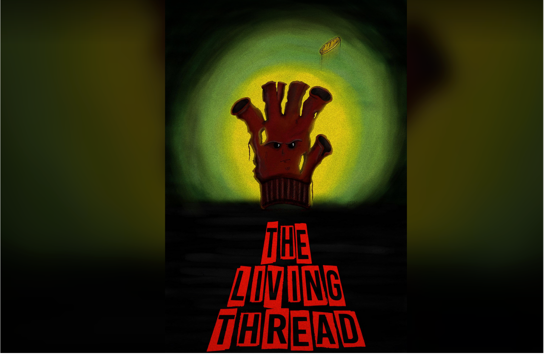
Once the image was determined, Adam was then able to reference the books titular homage. He selected a font that feels straight from an old horror film, and has placed it subtly against the cartoon image of the Maniacal glove.

The illustration now complete, but it's only one part of the overall cover design. At this point I enlisted the assistance of graphic designer, Owen (design@88WestDesign.com). Owen is a great illustrator in his own right, and having him collaborate on finalising the cover design was a real win for the book.
Not only does he understand the homage being presented with the books title and plot points, but he also has a pretty wicked sense of humor. This meant that the communications were fun, and it also allowed me to leverage some of his excellent ideas around plot summaries and blurbs. For the reader this means, if you don't think the plot summary sounds good, you can gamble on the book anyway because the guy who came up with the summary, didn't have anything to do with writing the book.
Remember, "never judge a book by it's cover" is impossible, so we can agree that it's okay judge a book by it's cover, but not okay to. judge a book by it's plot summary (if that plot summary was written by the graphic designer, and not the books author).
Anyway, I'm incredibly excited to share the end result of these covers with you in the coming weeks, both the digital cover (for kindle) and the paperback cover for hard-copy purchases and I'd encourage anyone looking to create something, to collaborate with like minded folk who inspire you to do your best work... who motivate you to pursue your goals... who challenge you to find the willingness to step beyond your comfort zone and strive for greatness... but most importantly work with folks who are within your budget (not enough motivational speeches take this into account).
Lastly, I just thought I would share with you a few of the lessons I learned in going through this process.
Cover design is about more than the image. You need someone to help you assemble the cover in it's entirety (including book blurb, author name, quotes, etc..)
Know the dimensions of your book cover before you begin
(I have opted for 6 x 9 inches. This size was selected as it in line with Amazon requirements for self publishing).Your spine size is dependent on your overall book format. This means that you need a total page count (including all front matter and back matter) as well as your paper choice, to determine how wide the spine should be. The equation to work out your spine size is as follows:
(Page Count / Pages per inch) + Allowance for Milling, Glue and Cover width.. Note: Pages per inch, plus allowance for milling glue and cover width are provided by your printerThe journey should be fun. I speculate that books with covers such as Twilight of Briareus by Richard Cowper may have subconsciously captured the overall sadness the process instilled in the authors psyche.

I hope you find joy in reading the Living Thread, or in the very least it doesn't leave you as sad as a bald baby's head orbiting in space.
* Disclaimer: I don't know Richard Cowper, this is purely speculation and that bald baby head, floating about in space definitely looks some what miffed.